
London Overground: A Brand New Identity
This article explores the recent rebranding of London’s Overground rail network, analyzing the motivations behind the change and its potential impact on passenger experience and network perception. The transformation involves the implementation of distinct line names and colors, replacing the previous system that relied solely on terminus station designations. This shift aims to improve the clarity and navigability of the Overground’s network map, a goal frequently criticized as difficult to decipher due to its homogenous orange coloring. The new branding strategy also seeks to enhance the network’s overall identity and brand recognition, fostering a stronger sense of place and connection with London’s rich history and cultural heritage. By examining the rationale behind this significant redesign, we can assess its effectiveness in achieving improved passenger understanding and overall network utilization. Furthermore, we will delve into the implications of these changes for future urban rail network development and branding strategies.
The Need for Improved Network Identity and Clarity
The London Overground (a network of six lines previously identified only by their terminal stations) suffered from a lack of clear branding. The uniform orange coloring of all lines on its network map created significant confusion for passengers, hindering intuitive navigation. This ambiguity undermined the network’s potential, making it harder for passengers to understand routes and plan journeys. The lack of a distinctive identity also hampered its ability to build brand recognition and attract a wider ridership base. The previous system, acknowledged by Transport for London (TfL) officials as “a complicated network of orange on route maps,” necessitated a change to improve user experience and network efficiency.
The New Branding Strategy: Names and Colors
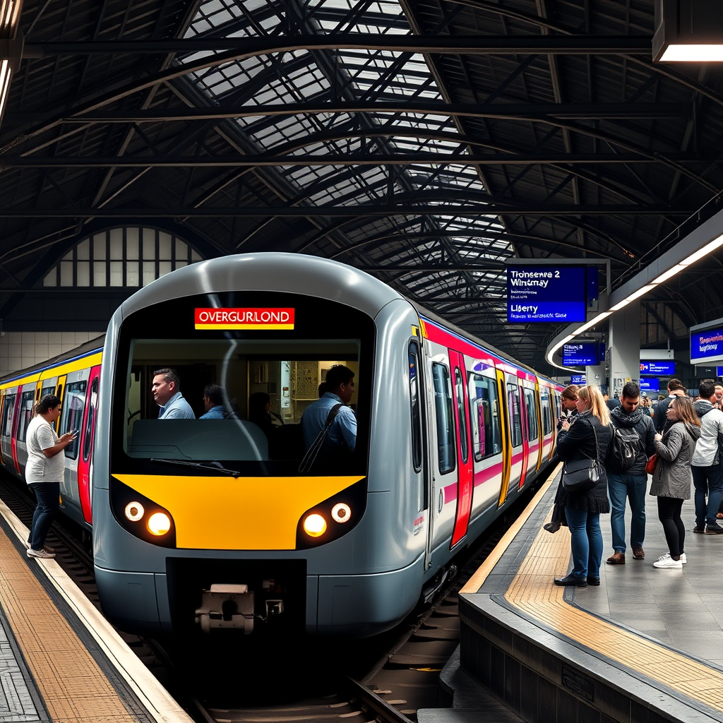
To address these issues, TfL introduced new line names and colors. Each line now bears a name that reflects a significant aspect of London’s history, culture, or landmarks. The chosen names – Lioness, Mildmay, Windrush, Weaver, Suffragette, and Liberty – resonate with various facets of London’s identity, from sporting achievements (Lioness) and social movements (Suffragette) to immigration (Windrush) and local industries (Weaver). The allocation of unique colors to each line further enhances clarity and distinction on the updated network map, greatly improving ease of navigation. This multifaceted approach tackles both the usability and the symbolic identity of the Overground system, aiming for both functional improvement and enhanced emotional connection with passengers.
The Impact on Passenger Experience and Network Utilization
The changes are expected to significantly improve passenger experience. By simplifying the network map and providing clear visual distinctions between lines, the new branding aims to reduce passenger confusion and improve journey planning. This increased accessibility should encourage more people to use the Overground, ultimately boosting network utilization. The symbolic significance of the line names also adds a layer of engagement, connecting passengers with London’s history and culture, thereby enhancing their overall travel experience and fostering a sense of local pride.
Implications for Future Rail Network Development
The London Overground rebranding serves as a case study for future urban rail network development. The success of this initiative highlights the importance of clear, intuitive branding and the power of associating transit systems with local identity and history. For other cities planning new or upgrading existing rail networks, the lessons learned from London’s transformation can be invaluable. Designing systems that are not only efficient and functional but also culturally relevant and user-friendly should be a key consideration in future projects, promoting increased ridership and positive public perception.
Conclusions
The rebranding of London’s Overground network represents a significant step towards improving passenger experience and enhancing the network’s overall identity. The previous system, characterized by a homogenous orange color scheme and a lack of distinct line names, created confusion and hampered navigation. The implementation of new names, each reflecting a key aspect of London’s history or culture, coupled with unique line colors, addresses these shortcomings directly. This multifaceted strategy aims to enhance clarity, improve user experience, and boost network utilization.
The new names, such as Lioness, Mildmay, Windrush, Weaver, Suffragette, and Liberty, are carefully chosen to resonate with Londoners and tell stories of their city. This approach moves beyond mere functional improvement to build a stronger connection between the transportation system and the community it serves. The enhanced clarity of the network map, a result of the new color-coding system, contributes directly to improved passenger navigation and reduces potential frustration and delays. This, in turn, encourages greater ridership and demonstrates a commitment to passenger-centric design.
Moreover, the success of this initiative provides valuable insights for future urban rail projects. The emphasis on clear branding, user-friendly design, and the integration of local cultural identity can significantly impact passenger perception and network usage. By understanding and applying these principles, cities can create rail systems that are not only efficient but also engaging and reflective of their unique character. In conclusion, the London Overground’s rebranding is not just an aesthetic upgrade, but a strategic move towards creating a more accessible, user-friendly, and culturally relevant transportation system, setting a positive precedent for future urban rail development globally.
RELATED POSTS

July 24, 2015 7:02 pm
Alstom’s first Citadis tram for Cuenca, in Ecuador, has arrived...

November 12, 2017 10:52 am
Siemens has received an order to upgrade the fleet of...

November 22, 2017 6:11 am
Unlock the economic potential of the Baku-Tbilisi-Kars railway. This...

October 17, 2025 2:54 am
The **TRU Community Fund** offers £250,000 for local organizations near...

October 8, 2025 3:54 pm
Newcastle-under-Lyme Council considers a £2.7m **Kidsgrove railway station** upgrade, led...
January 11, 2019 9:47 pm
China's investing 6,800km in new railway lines—a massive undertaking impacting...